Images
Vectors
Custom
Examples
Pale Dawn
This tileset has a calm, restrained style designed to work well with lots of data points. It’s less about the geographical information as such, and more about providing a suitable background to foreground information.
Midnight Commander
You know, for when you’re Jason Bourne and you’re on the run from the man and you break into the command center and you pull up the secret map interface? That one.
Satellite
Want to show what Earth looks like from space? The Bing Maps imagery metadata API provides beautiful aerial (satellite) image tiles at a wide range of zoom levels, with optional labels.
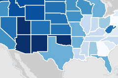
Statehood
This simple visualization uses color to encode the date each of the fifty United States joined the union; lighter states joined earlier, and darker states joined later. Choropleth maps are easy with vector tiles, while allowing zooming and dynamic colors.
Population Density
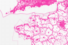
The 2000 Census is a treasure trove of interesting data about these United States. Here we show population density of 3,134 counties using a choropleth map; darker counties have higher population densities.

Unemployment
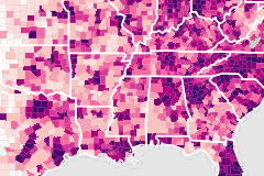
Another gem from the Census Bureau; here we show unemployment rates (as of September, 2009) of 3,218 counties using a choropleth map; darker counties have higher unemployment rates.
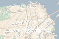
Pavement Quality
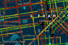
This visualization shows the pavement quality of San Francisco streets, mashing up two datasets from DataSF: paving PCI scores and street centerlines. Streets with high pavement quality are shown in green, while those in the worst quality are red.
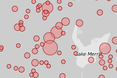
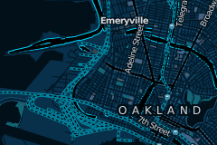
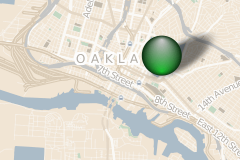
k-Means Clustering
Symbol maps, such as those used by Oakland Crimespotting, are great for visualizing discrete events across time and space. But what happens if you want to show thousands of points? Here we use k-means clustering to coalesce dots and visualize the density of crime in Oakland.

Internet Usage
The CIA World Factbook is a useful data source for global country comparison. In this example, we combine two data tables and a custom GeoJSON layer to show per capita internet penetration.
Flickr Shapes
Take all of the Flickr photos geotagged for a particular place. Draw a hot pink outline around them. What you do get? Flickr Shapetiles: a crowdsourced, empirical representation of geographic entities inferred from vernacular usage!
Shadows & Gradients
Sometimes you want to take advantage of the raw power of SVG! Polymaps produces a clean and well-behaved SVG tree, allowing rich graphical effects to be applied through post-processing with JavaScript and CSS.
Affine Transform
Polymaps can translate, rotate, scale and shear a tileset using an affine transform, so that any zoomable image can be overlaid onto a map. In this example, we overlay an old map of Brooklyn courtesy of the New York Public Library.
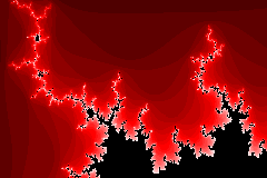
Mandelbrot Set
The Mandelbrot set is a fractal set popular for its pleasing aesthetics and simple definition. Here we generate map tiles procedurally, visualizing points in the complex plane with HTML5 Canvas.
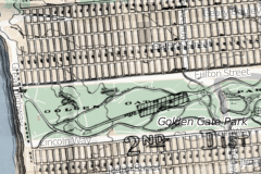
Image Overlay
Sometimes you just want to throw an image on a map. This example shows how to position an image using two locations for the top-right and bottom-left corner. The map takes care of panning and zooming!
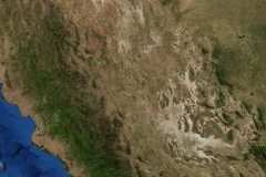
Blue Marble
The NASA Earth Observatory published a series of 500-meter resolution satellite imagery in 2005, in true color showing seasonal dynamics at monthly intervals. Custom image tiles are easily adopted with Polymaps.
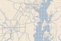
Lat-Lon Grid
The built-in grid control draws lines of constant latitude and longitude over the map. The grid reveals that the spherical mercator projection is cylindrical: longitudes are uniformly spaced. The lines are subdivided as you zoom in to maintain constant density.
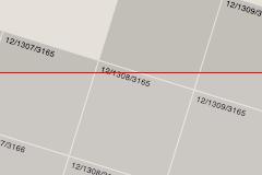
Tile Grid
Use this lightweight layer implementation to explore the tile grid. Polymaps uses a polygon-fill algorithm to determine exactly which tiles are visible, given arbitrary zooming, panning and affine transforms.